
The Amateur's Embrace: Gerasimos Floratos @ White Columns
The word amateur stems from the Latin root amātor, which means lover. Over time the term has come to harbor negative connotations, giving people reason to dismiss the amateur for not having enough command in their activity of choice. They are too unskilled and inexperienced, lack deliberation and control, and approach anything and everything without sophistication. Passion and potential they may possess, but the love they project outwardly tends to lack full reciprocation. Only partially conscious of what they are doing, the amateur's work is sparsely attended to by an audience, making their pursuit a lonely one. A lover in solitude, but many are out there.
There are those, however, who do pay attention to the ways of the amateur. The majority of them are artists who intimately engage with artworks created by novices, using what they find as reference material or a source for creative inspiration. In some cases artists appropriate the amateur's aesthetic to guide their own methodologies. Picasso and the cubists incorporated the forms of primitive African masks into modernist painting, and in the post-war period, Dubuffet and the art brutists engaged with art made by “outsiders:” children, the mentally insane, and untrained. The contemporary painter Gerasimos Floratos, who recently exhibited eleven works on canvas and twenty-one works on paper at White Columns in New York — and is not academically trained himself — seems to be carrying on this pursuit of borrowing from the amateur with a 21st-century sensibility.

Gerasimos Floratos, Tristate Allstars, 2016. Courtesy of White Columns, New York.
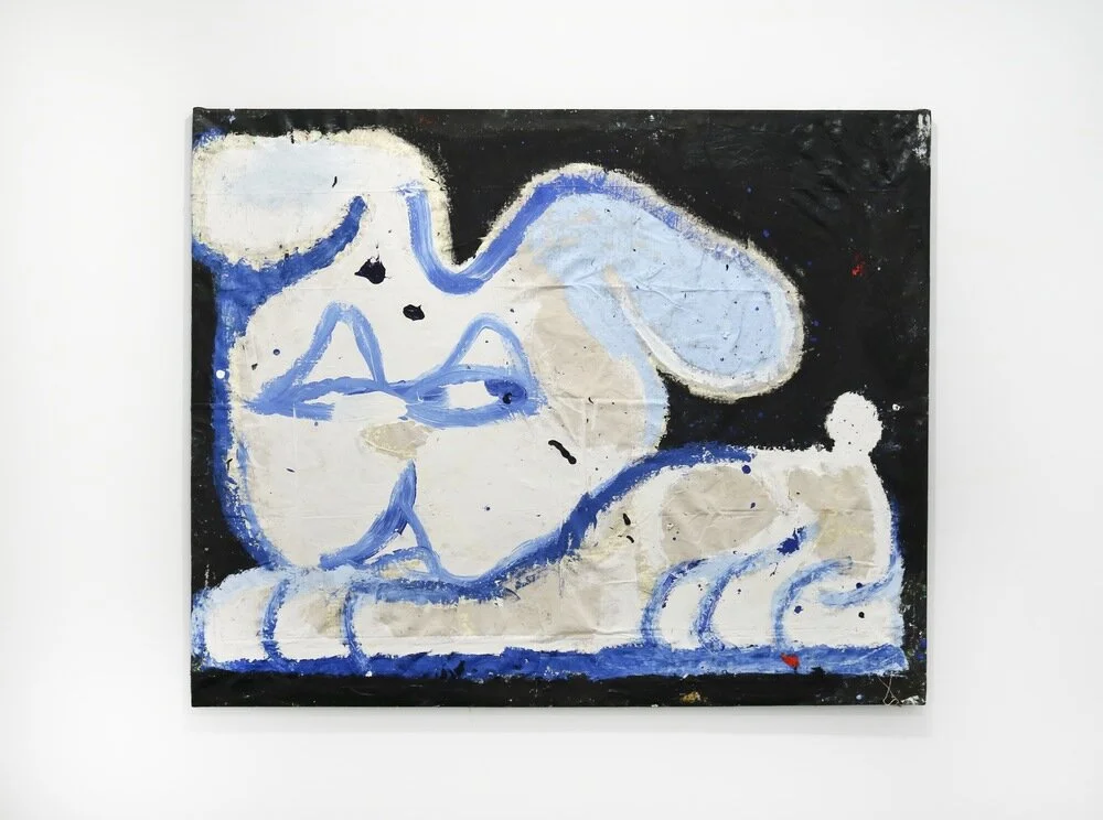
At a quick glance, Floratos’ presentation appears to be simply the product of an unskilled hand. If one were to evaluate the exhibition based on the standard metric of painterly conventions, he would fail on nearly every count. The majority of his canvases are haphazardly stretched to the point where they slouch: one can almost imagine them rustling like sheets in the wind if they were lightly blown on. Some surfaces are lumpy or crinkled in various quadrants, and all of the canvases are soiled and unkempt. The materials are cheap, and chalky paint is brushed on in wide, unwieldy strokes. Bold colors are liberally applied all throughout the picture plane, but each piece uses a relatively limited palette. Drawings are executed on the surface of standard computer or craft paper, with what looks to be the most rudimentary Crayola markers and crayons. Pictorially, the subject matter would be considered sophomoric. The majority of the paintings depict closed framed graffiti-esque portraits of truncated or smushed cartoon characters; they have the feel of doodles conjured up by high school boys bored in class.
All of these features combined surely do not carry the hallmarks of serious culture or its tradition. But there is something more going on. The merits of his work cannot simply be reduced to pure kitsch. Floratos sees the hidden brilliance in the qualities of unskilled artists and transfigures them into a stylistic motif. The strict list of things “not to do” in painting — such as using low-grade materials, dirtied canvases, weak stretches, and sloppy techniques — are turned on their head and become the general rule that Floratos operates under. He takes all the naive mistakes made by the novice and purposely exaggerates them to the point where they become compelling gestures. Even if the result is oftentimes ugly in the sense that the compositions and subject matter are not delightful, overall, they manage to become good paintings worthy of consideration.

Town Square Alignment, 2016. Courtesy of White Columns, New York.
The most successful choice by Floratos is to use enormous canvases. With the exception of one piece, Untitled (Figure), none of them are under sixty inches in width or length. This way, the caricatures he portrays are larger than life and loom over their audience. Considering the scale alone provides evidence that his practice transcends amateurism because of its mindful formal decisions. Beyond size, the overall compositions coalesce all their elements in a satisfying way. There is a level of sophistication in the use of negative space, and the layout of the images logically follow the shape of the picture plane. Further, the distribution of color is in most cases balanced, provoking the eye to smoothly follow the paintings’ rhythm. Town Square Alignment, one of the best works in the exhibition, runs the risk of looking top-heavy since the bottom of the painting is minimally worked through in lightly colored paint, whereas the middle-top areas are heavily undercoated with dark hues. Yet, without being a distraction, a small triangular field of black on the bottom edge brings everything together like a linchpin.
Local Soft Body, 2015. Courtesy of White Columns, New York.
Although the majority of his portraits appear to be standing humans, they are melded with traits from other creatures such as rabbits, praying mantises, and frogs. Only two paintings, both titled Local Soft Body, are unmistakably more bunny than man. The anatomies of several bodies are compressed, making them unusually contorted and hard to decipher immediately as a rendered figure. Untitled (Figure), TS Dual Postup, and Mystic Taxi are the pieces that most quickly deteriorate into organic shapes. All lacking torsos, their midsections are nothing but a flimsy connecting point for ballooned hands, feet, and faces. Perhaps unintentionally, the characters look like a personified cortical homunculus, a diagram that visualizes the brain’s sensorial relationship to parts of the body through scale. Floratos’ paintings want to induce a corporal effect on the viewer, to heighten their awareness of the sensitive areas of their own bodies, where nerve endings are densely clustered.
Because of their size, abstract compositions, and innervating effect, the images are a confrontational experience. Such strategies play well into the archetypes Floratos creates, which he calls “sketchballs and lurkers.” They are reminiscent of stereotypes you would find in urban street culture from the late 1990s through early 2000s: Homies, Ravers, Pot Heads, B-Boys, and other riff raff. At once reclined and in mid-pose, the figures, with their squinted eyes and blunts in mouth, conspicuously sport baggy clothes, bulky sneakers, Kangol caps, or large belt buckles. Their standoffish composure and look of suspicion or inebriation shows the emotional weathering they are subjected to as city slickers. In fact, the residue embedded on the paintings’ surfaces reflects the grittiness of street life, capturing dirt like a makeshift air filter. They act as a reminder that despite all the superficial cleansing programs that metropoles are implementing — concealing graffiti and tag markings, planting flowers in empty lots, or the dislocation of the homeless and drug addicts — the grime of urban life persistently returns since the source is never truly addressed. Floratos’s paintings scrape at the underbelly of society and prominently display its undesirable elements — the ones that cities obsessed with sanitation go at lengths to conceal. But the work looks more goofy than menacing, as the characters appear to always be “keeping it cool.” Whether or not this trait can be read as an ode to a style, or a representation of a defense mechanism, is up for the viewers to decide.

Spread from the zine by Gerasimos Floratos and Eddie Martinez (image courtesy of Chris Mansour).
The paintings on canvas by far display the most confidence and demand the greatest attention. There are several interesting drawings, but presenting them as framed discrete works feel a bit forced. Additionally, the choice of using smooth bright white computer paper for some of the pieces, although conceptually sound because of its cheapness and ubiquity, seem to clash with the tactility of Floratos’s mark-making. The drawings are most at home in the format of a zine, and a free one was indeed co-released with fellow artist Eddie Martinez for the opening event. Printed on thin, recycled sheets — likely one grade above newspaper — reproductions of their aggressive penmanship and gritty colors are intermingled throughout the pages. It would be interesting to see how this paper type bound together would correspond with Floratos’ direct application of paint or marker. The effect of how the oils and inks are absorbed into the fibers might enhance his chosen aesthetic since both sides would be viewable.
As a whole, it is clear that Floratos has revamped the ways of the amateur and did not merely mimic them. He brings out the best of these techniques (or lack thereof) by improving their affect, by making them more than they normally could be. A rare talent but a necessary one, as it encourages people to see something new in what is often hastily overlooked. Hence, a distinction should be made between what is mediocre and what is amateurish, as the two terms are not equivalent on a deeper level. To paraphrase the photographer John Gossage, “I like things that should not work but for some reason do.” Floratos might as well adopt this as his maxim since he embraces all the wrong moves in an attempt to make them right. For that reason, he is an amateur in the true sense of the word. //